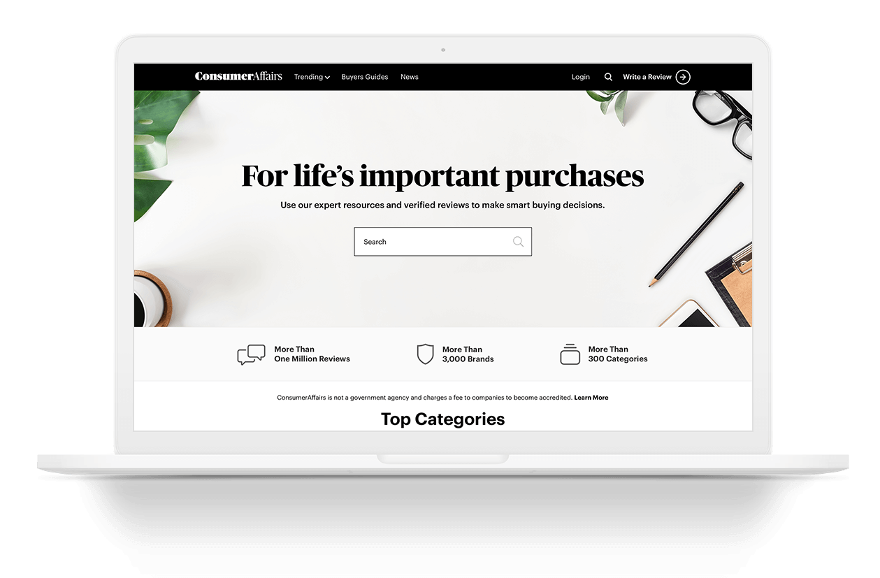
ConsumerAffairs
Helping people make important life decisions and purchases.
Project: Buyers Guide Template
Roles: Head of UX Design, Research, Art Direction
Duration: Q4 2019 - Q12020
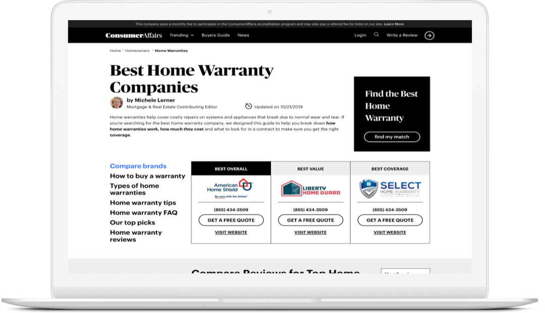
Click through to see Buyers Guide page designs old to new
BACKGROUND
ConsumerAffairs underwent a rebrand in 2019. As part of the senior leadership team we felt it necessary to update the branding to reflect the company goals and motto. The branding at the time lacked trust, was misleading and was a bit juvenile. For the brand to move forward, leadership wanted to convey a brand that evokes:
- Professionalism
- Trustworthiness
- Helpfulness
The Plan
ConsumerAffairs teamed up with the infamous Paula Scher and her team at Pentagram to design a logo that reflected the above qualities. The plan was to start with the logo and let that guide the overall design, including iconography, typography, image style, color pallette, etc.
For the purposes of this portfolio, I am going to highlight the process for the Buyers Guides page template, that were deemed as most impactful for the top of funnel team.
Process
INFORM/STRATEGIZE
Stakeholder Meetings
I met with the Product Manager, CTO (acting VP of Product) and the Director of Front-End Engineering to discuss the goals for the rebrand. The discussion resulted with the following:
- Rebrand needs to not hurt SEO
- Improve Product table design
- Optimize CTAs

Stakeholder meeting
winning concept
RESEARCH
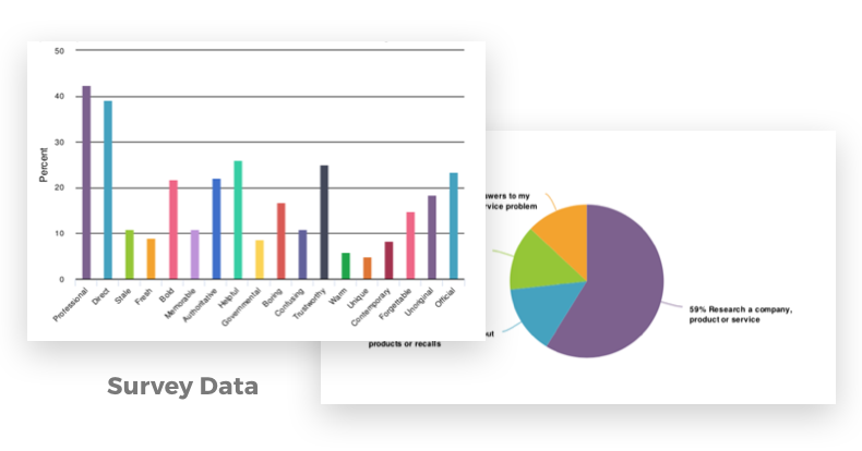
User Surveys
I collaborated with the Pentagram team to put together a few rebrand concepts. I ran a user survey on our site to get reactions from our customers on the new brand direction. It was important for us to connect with our loyal users, to inform us and provide feedback on a new look and feel.
Our goal was to provide a brand that embodied the following: Professionalism, Helpfulness, & Clarity (Direct)
We chose the design direction based off the survey feedback
- Rebrand needs to not hurt SEO
- Improve Product table design
- Optimize CTAs
- Provide clear information to help users choose better
RESEARCH
User Personas
ConsumerAffairs has a powerful database that allows us to see several data inputs from our users. While still in its early stages, the team is able to extract key information. With that information we can create User Personas.
While this is not an exact science, it helps us understand more about our users, and will only improve over time as the data gets more organized.
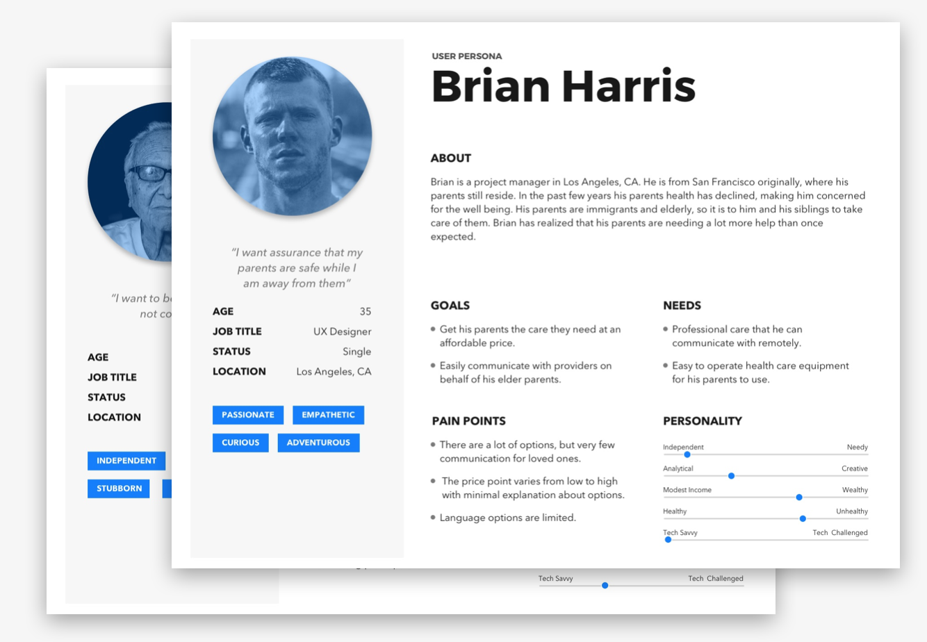
User Personas
Best Reviews Example
RESEARCH
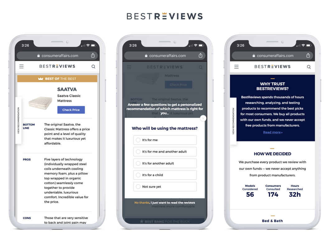
Competitor Analysis
I gathered data from industry competitors to determine missed opportunities and areas of improvement. Many of the areas of improvement surfaced in the stakeholder meeting and were evidenced in our competitors.
(Best Reviews is just one example)
Features
- Superlatives - Best of the Best, Best Bang for your Buck, etc.
- Comparison Table
- Matching Tool Entry
- "Why Trust Us?”
- Editorial Content
- Methodology
- **FAQ Section
- **Star Rating
- **Reviews Link
- **Navigation
** Indicates a feature of ConsumerAffairs, but one a competitor lacks
DEFINE
Defining the Problem
How can we improve the Buyers Guide pages to better inform our users, increase engagement and in turn increase conversion?
Hypothesis Statement
We believe that improving the product table design and position will help users understand product features and clearly identify the CTA on the page in order to help them meet their specific purchasing needs and goals. We will know this to be true when we see a 10% increase in conversion rate.
CREATE
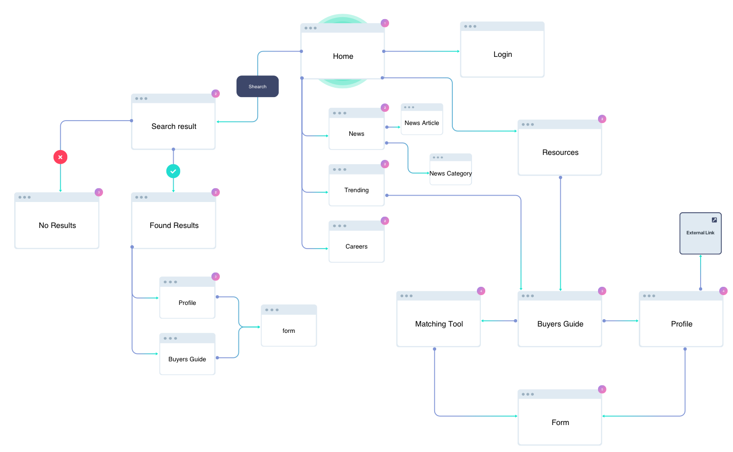
User Flow
I developed a user flow diagram to determine which step to page in the flow is most impactful or if there could be a more efficient way to get to a conversion. For our purposes, one of the goals is to get a user to submit a form, so discovering the most effective flow to get to that was the challenge.
Based off the flow and info provided by Data & Analytics team, the Buyers Guide was the most impactful page to focus on.
user flows
pair design session
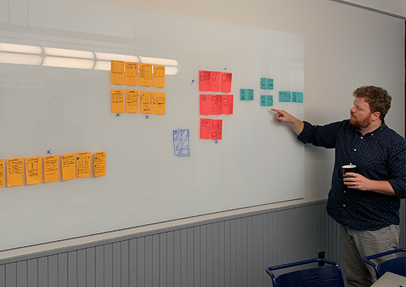
CREATE
Collaborative/Pair Design
I worked in tandem with another designer to optimize the design. The challenge we faced was having to stay within the style guide from Pentagram, since they only provided 3 templates (out of 15+). There was a lot that was left out of the guide that I had to create.
- Value Prop Enhancement
- CTA Improvement
- Layout of product/brand card
- Identify/Highlight accredited brands
TEST
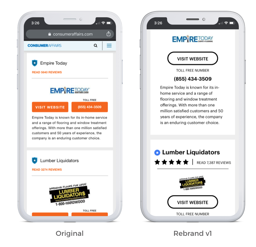
A/B Testing
In collaboration with the PM and category manager we decided on testing the Buyers Guides. Knowing that we were going to go through the rebrand, we had to first get baseline data on the new designs. Round 1 was an A/B test to get a baseline.
The changes we applied to the brand card on this round were:
- Isolate the CTA by removing the phone number from a button
- highlight accredited brands vs unaccredited brands more clearly
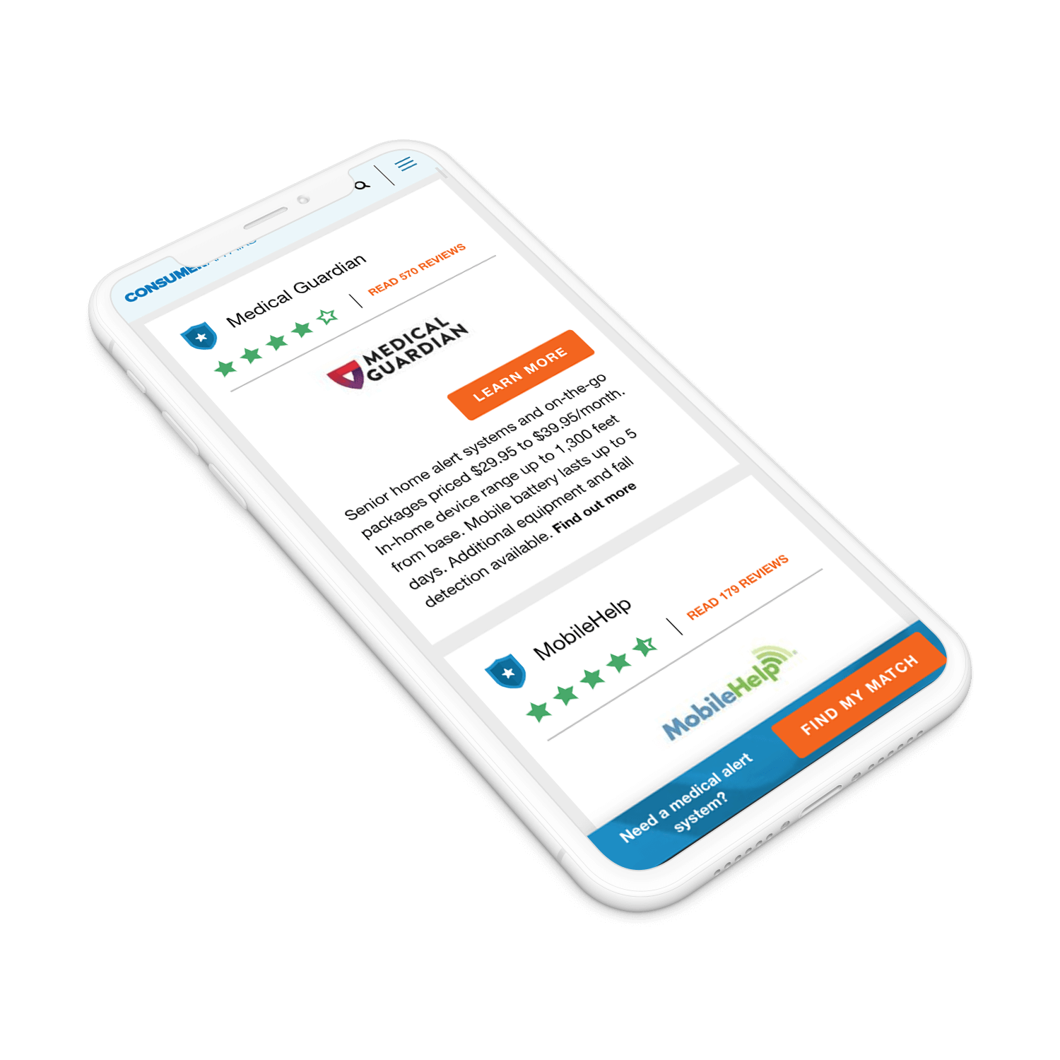
Observation: Some of the things were tested with the hunch that they would not work. The rebrand designs by Pentagram seemed more like print design and not conducive to web.
Click through Buyers Guide Tests
LEARN
Testing Analysis
V1 with the black ghost buttons did not perform well. It resulted in a 25% decrease in conversion - YIKES. My assumption was that the ghost buttons did not have enough contrast to the rest of the content in the cards. Users aer unfamiliar with that design pattern or they just did not see the clear enough to engage.
Next Steps
For the next test we would use a more recognizable button pattern and add color to increase contrast of CTAs on the page
While this test did not perform how we would have liked, it was a great learning experience and confirmed how important user testing is.
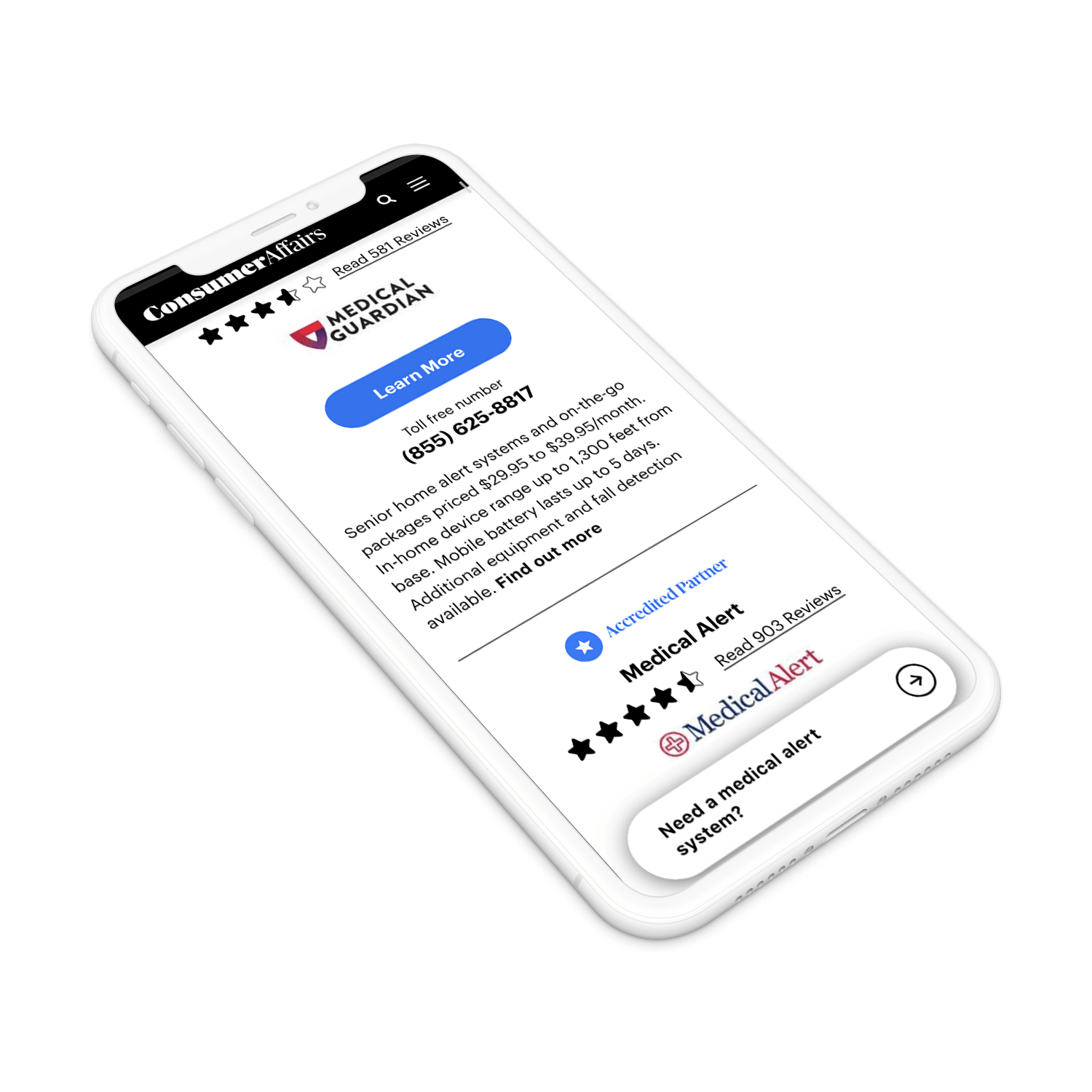
Buyers Guide desktop V1
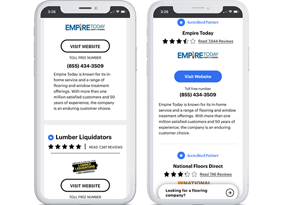
Black ghost buttons vs. Blue buttons
REFINE
A/B Testing Round 2
The next iteration to test was the blue buttons instead of the black ghost style. Our hypothesis was that the blue buttons would provide more contrast and clarity as a CTA. This simple iteration resulted in a 5% increase of conversion rate. It goes to show you that often times the most simple changes can make a difference. With that improvement we decided it was enought to roll out for all categories and continue to iterate upon this new design.
SHIP
Design Handoff
Now that the conversion rate was going in the direction we wanted, it was time to ship to production site-wide. We understood that the change was small, but were confident in being able to iterate on a design that was proven to increase conversion. I was responsible for meeting with developers to address the following so that we could push the design to production:
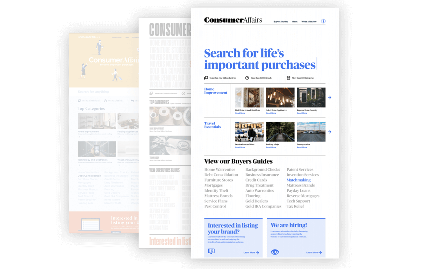
- Finalized Mocks in Zeplin
- Style Guide consistency and updating
- Desk checks for animation
- Access to all files, prototypes, assets and media for reference

Zeplin assets for dev team
" Tony is a creative, resourceful, and practical designer. He is easy to work with and insightful about both the business and the customer. He handles high pressure and high speed with astounding poise."
by George Earl, VP of Data & Analytics, ConsumerAffairs.
Stats
What is the impact of all of this?
5% lift Conversion Rate
Testing and iterating with the rebrand allowed us to move the needle in the right direction. 5% is not the target we hoped for, but with continued iteration that is a reachable goal. In fact, by applying these learnings to other categories, that is an easy win.
2x Conversion on News
Unrelated to the Buyers Guide, but not surprisng, the rebrand did have an affect elsewhere. We saw conversions in the News section double! This section had been previously ignored and is now shaping up to drive conversion opportunities.
The Takeway
What does this mean for the user? It means that the new design is clearer and provides more opportunity to help people make important purchasing decisions. As a byproduct it also helped the UX team validate the testing process to other organizations and leadership.
Challenges & Growth
There were certainly some challenges that I faced with this project, but I am happy with the grit and determination to push through and get it done.
Challenges
- SEO constraints / guard rails. ConsumerAffairs relies heavily on SEO still
- Incomplete Style Guide from Pentagram
- Time to ship - Dev was a large blocker at times and I often had designs ready that sat for weeks
Growth Development
- UX Team Collaboration
- Art Direction
- A/B Testing
- Dev/Design teams collaboration
Project description
The ConsumerAffairs rebrand is still in motion. It was a project with many collaborators, spanned across the globe. The Buyers Guide page template is an example of a successful collaboration, hard work and many iterations to meet our goal of improving conversion rate.