HomeAway Case Study
Case study of new features to the HomeAway app for iOS
Project: Case Study
Roles: UX/UI Design, Research, Visual Design
Duration: 2 weeks

Purpose
I am a fan of the HomeAway app and its simplicity to book a property. I did however see a potential in adding some features. The features I explored are adding nearby attractions or sites to the property and a sorting function while browsing available listings.
Process
Various steps to explore the app functions, pain points, delights, and possible added features.
Exploration
I looked at the app first as a user who was aiming to book a property for a vacation. Currently, the app flow is the following:
User Story
"As a traveler I want to experience a city the way the locals do."
User Flow
- I want to book a vacation
- I want to go to the Colosseum in Rome
- I want to stay in a home
- I want to spend between $150-$350 per night
- I choose home based on filters and requirements
- I explore images, location & overview
- I check availability
- I book
Pain Point / Missed Opportunity
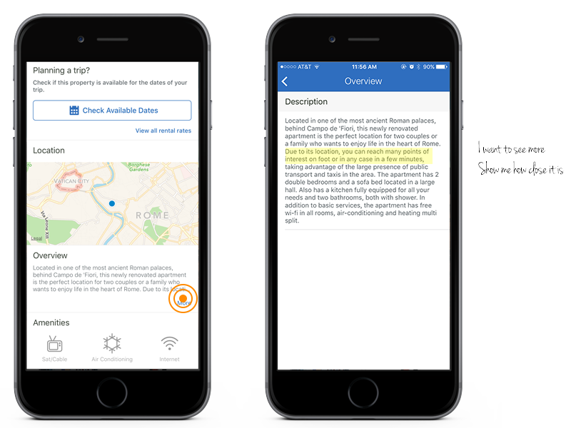
The Overview Section
When exploring a property, the overview section is lacking. The opportunity here is to show the user the perks of the property in order to confirm that the property is worth booking. There is a map that shows where the property is, but it is very small.
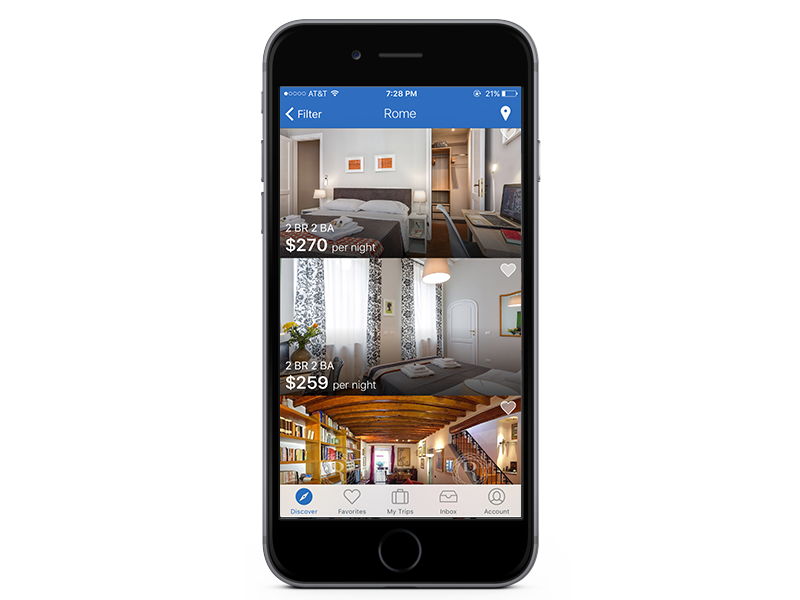
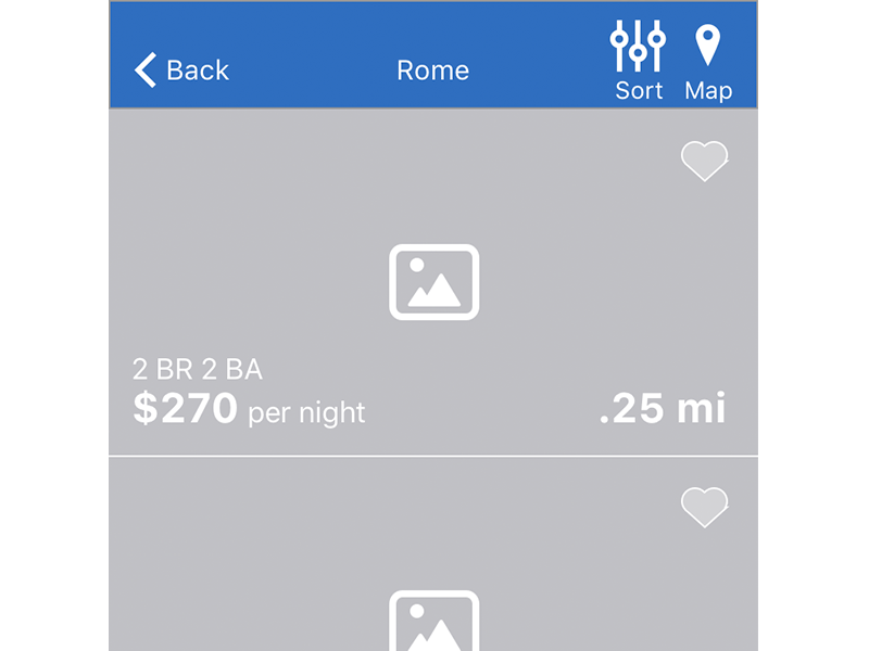
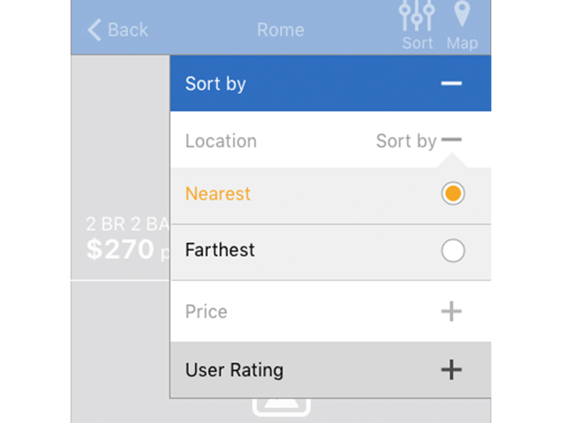
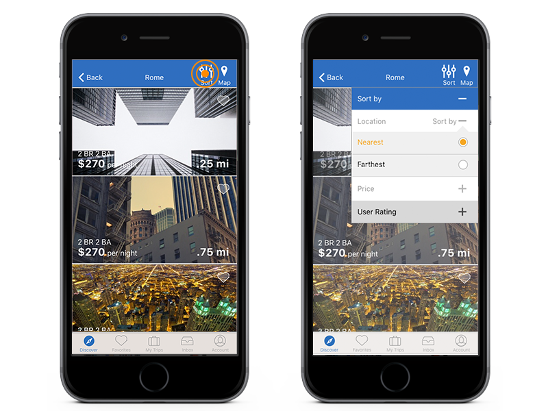
Browsing Listings
Through testing and conducting user interviews, there was frustration when browsing. Even after one set all the available filters, there seemed to be a lack of reason or order to how each property was listed. According to users, a sorting or categorizing function would help make the experience not only more logical, but would help travelers browse smarter.
current app overview & browsing sections
Proposal
I propose a feature that allows the user to see the benefits of the property and further entice users to book. The overview currently allows for a description, which is good, but there is potential for a better experience. By adding images, the user can get a quick visual of what is nearby. These images could be of nearby attractions, restaurants, and transit systems.
For the browsing section I propose a sorting function that enables users to organize how listings are viewed. The options to view listings through a sorting function would allow more control when booking. Sorting by price, location, and popularity are just a few examples.
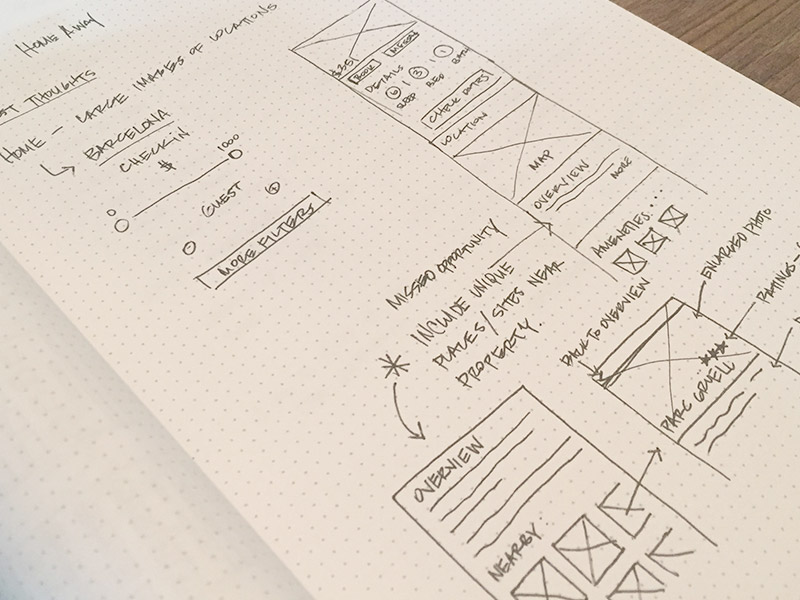
wireframe sketch of visual overview
Implementation
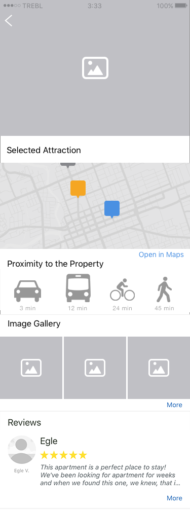
Showing More in the Overview
Through visual cues and implementing the yelp or google api, the overview section has the potential to display attractions that are in close proximity to the property. To start, basic categories would be displayed. This is not intended to be a complete yelp integration, just use the api to bring in relevant information that would sell the property better.
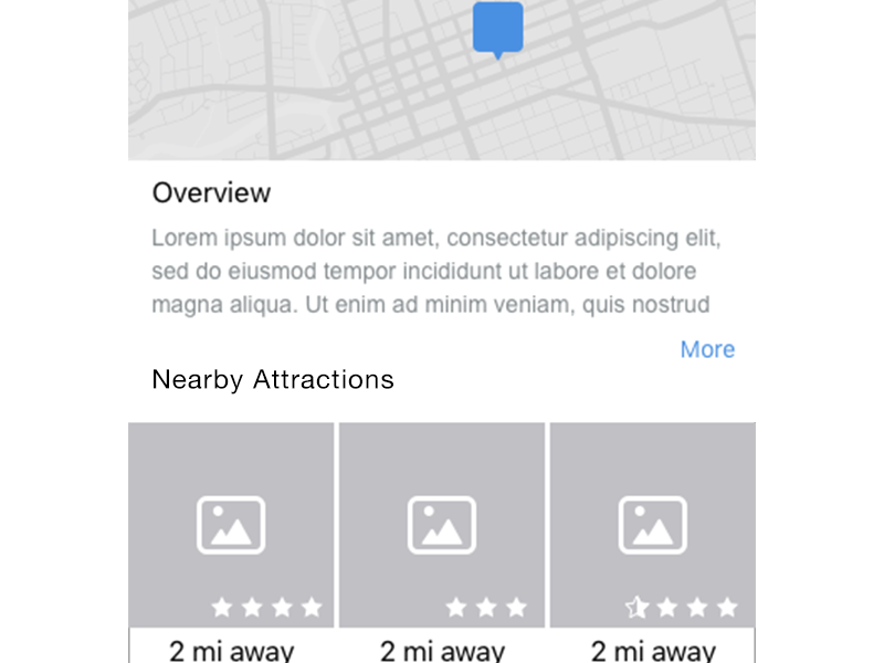
New Feature Mockup: Nearby Attractions in Overview
The new feature shows nearby attractions to the property to enhance the overview.
- Listed attractions based on categories
- Ratings generated by Yelp
- Description of attraction
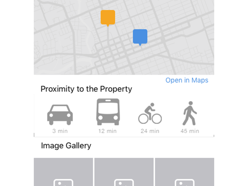
Once you click on the attraction the next page shows:
- Map with property & attraction proximity based on various modes of transportation
- More images from Yelp users
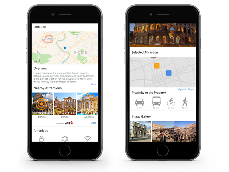
iOS app mockup