Strokers Dallas
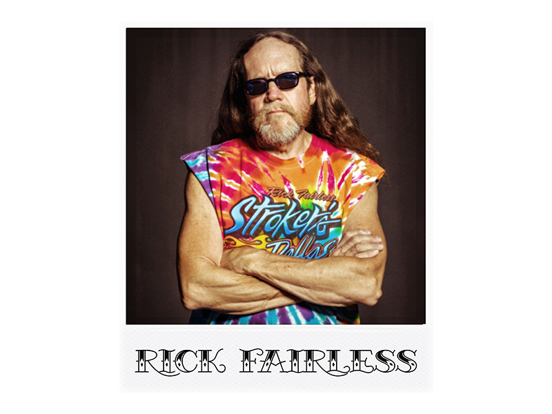
Rick Fairless' Motorcycle Empire
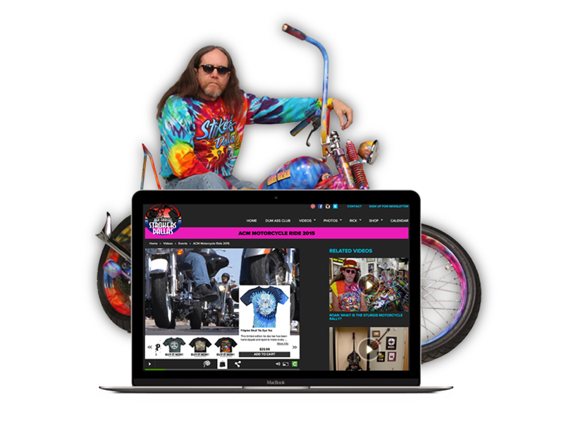
Project: Website Redesign
Roles: UX/UI Design, Research, Visual Design
Duration: 4 weeks
BACKGROUND
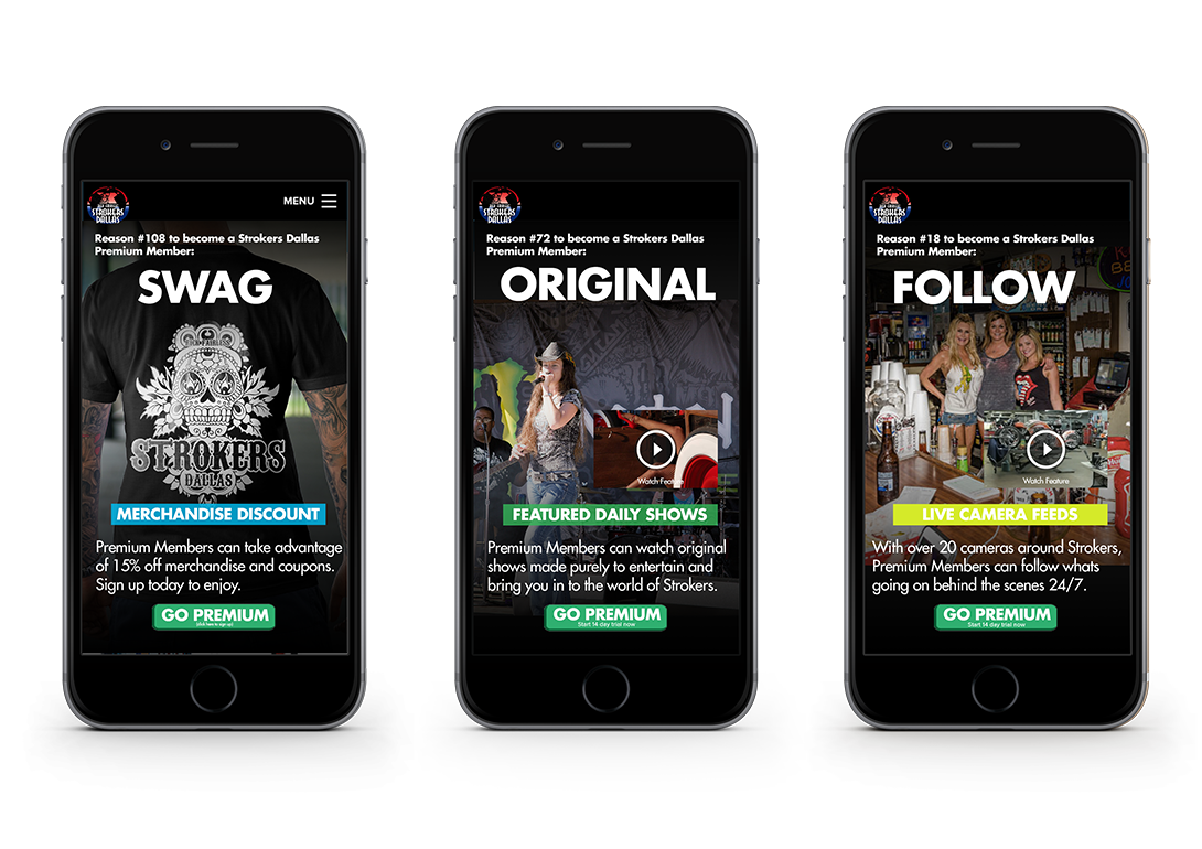
The creative team and I collaborated with Rick and his staff to create a destination online where members and enthusiasts could take a look into the wacky world of Fairless. The goal of the site was to allow for as much access and excitement to members, as if they were there in person. With Cinsay's technology, live stream feeds were placed in various places of the compound, allowing for a peek of the action. We built a membership system which provided members access to outside stage areas for concerts and events, the bar, and even a look into the mechanic shop to see the master mechanics at work. One of Rick's goals was to distance himself from the strip club vibe and become more family-friendly.
Other more generic goals were set, such as making the site responsive and updating the e-commerce element.
As a team we had the opportunity to do several forms of research to drive the redesign.
RESEARCH
Stakeholder meetings
We sat down with Rick Fairless and his team to try and understand his vision. Here are highlights:
- Partnership with Cinsay
- Keep consistent with the brand
- Tell Rick's story
RESEARCH
On-Location Interviews
We went to Strokers Dallas several times and spoke with patrons there. We asked them questions to try and figure out which features should be implemented. We asked about:
- Which areas should have live stream
- How often they came to Strokers for events and downtime
- Shopping habits
- Online streaming habits
- Which areas do they spend most time in
TESTING
A/B Testing
After some data gathering and figuring out the features that were needed for the site, I created some mockup pages to get a feel for what users were thinking. There were a couple of rounds of testing, each round with a different purpose.
- Dark vs Light theme for site
- Focus - Bikes vs. Events
- Different mobile layouts
- Calls to action
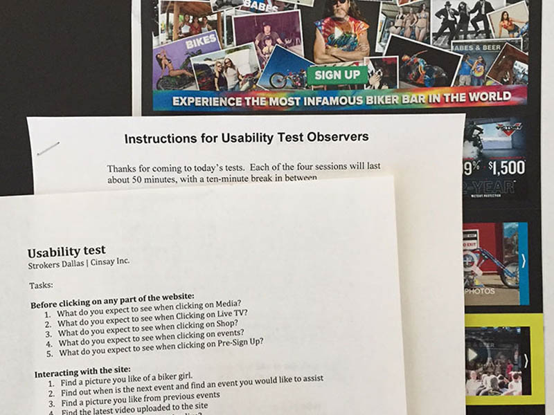
TESTING
Usability Testing
We brought in people to participate in usability tests in a sandbox environment. It was interesting to watch how different people navigated the site and performed the various tasks. We used candidates from varying backgrounds and interests. Here are few things we learned from observing:
- Photos/Videos Search - There was not a way to search for specific events, people, or bikes.
- Photos/Videos Filter - Users wanted to be able to filter or view specific category batches.
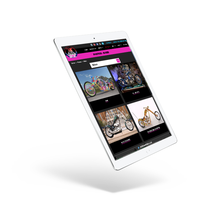
- Bikes - It was not obvious enough how to view bikes for sale.
LEARNING
Analysis
The various methods of research helped me understand things that I needed to consider or rethink. It was interesting to see the varied responses, the patterns, and the direction that it led me to further down the road. The items below refer to the different areas that we spoke to customers about during on-location interviews.
Ice House Bar
Areas to focus on the bar were:
- Not just a bar, but good restaurant
- Highlight daily specials
- Highlight special and regular events
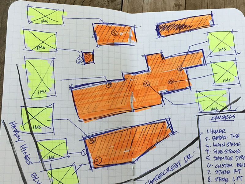
The Garage
Strategically placed cameras provide:
- In-depth look at builds and progress on repairs
- Tips and tricks from mechanics
- Specialty bikes and projects
The Patio
Installing cameras in the patio would allow users to view:
- Televised rallies
- Live stream contests
- Live stream concerts
- Live stream charity events
The Store
Here are incentives and ways for customers to shop:
- In person at the shop
- ecommerce stores
- Cinsay platform
- Advertised sales
- Discounts for members
- Free items for signing up
User Personas
Mark Madson
The Gear Head
- Age
- 36
- Profession
- Educator
- Location
- Dallas, TX
- Motivations
- Rides a motorcycle daily and maintains his own bike. He shops at Strokers for parts.
Greg Waters
The Old Faithful
- Age
- 44
- Profession
- Business Owner
- Location
- Dallas, TX
- Motivations
- Stay connected to Rick and Strokers events.

David Katz
The Weekend Warrior
- Age
- 29
- Profession
- Pharmaceutical Rep
- Location
- Dallas, TX
- Motivations
- Enjoys bikes on the weekend and likes going to Strokers for events with his girlfriend.
CREATE
As any designer knows, this was an iterative process driven by data that evolved as information was gathered.
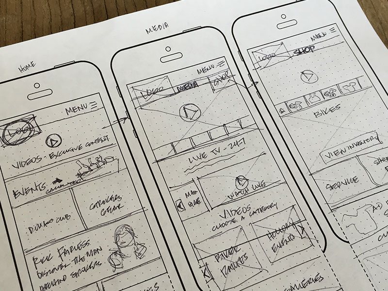
Sketches
Sketching mobile layout and assets for the site
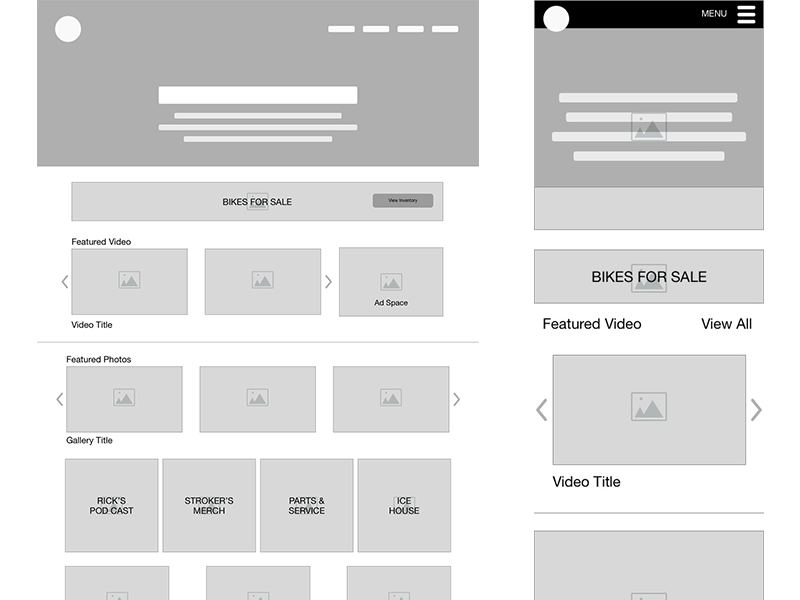
Wireframes
A more polished approach and being able to use tools like Sketch to work out user flows and interactions with the pages that required it.
Observations and Considerations
We aimed to keep consistent with how a page with media looked. This allowed for module type building of the page and reusing elements and functions across the site. It allowed for quick development and adjusting across the board if it was needed in the future. These elements included:
- Search capability
- Category breakdown
- Media title label
- Same grid structure
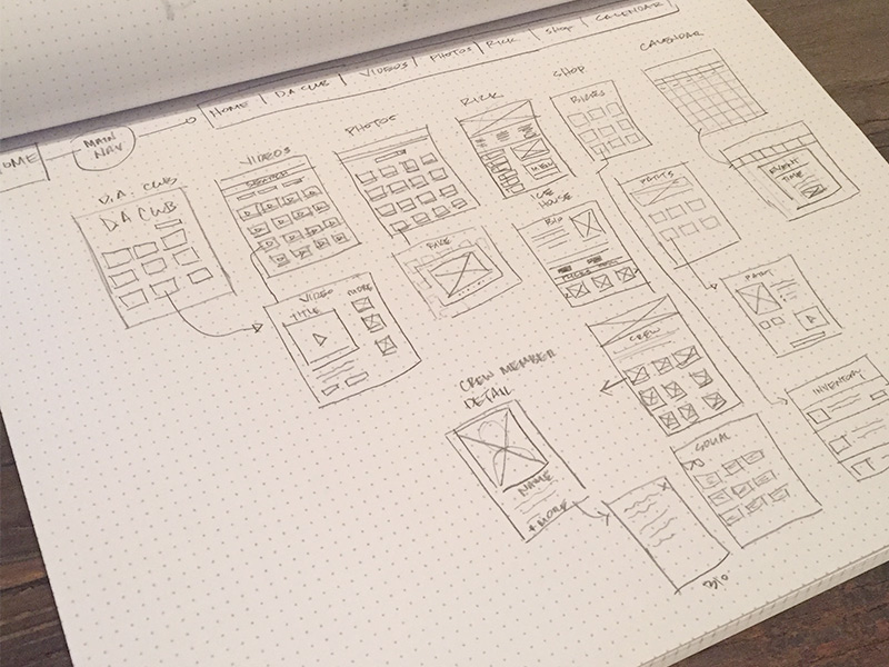
User Flow
Quick iterations of the process and flow of how the user navigates through site and interacts with elements on each page.
LEARNING
Constraints and Challenges
Privacy
Certain areas on the property required protection from the public eye. Areas like the bar and the mechanics garage required special attention to allow for an all-access view, but discreetly.
Thematic Consistency
Strokers is a museum of sorts and Rick wanted to incorporate his funky style to the site. The shop is cluttered and vibrant with color and memories everywhere. Maintaining that eclectic look, with some form of order was a challenge.
Reputation Shift
Strokers is known for 2 things: bikes & women. Rick wanted to distance himself from the "strip club vibe" and focus more on a more wholesome experience. We aimed to do this by pushing bikes, charity work, and family friendly events to the forefront both on the site and social media.
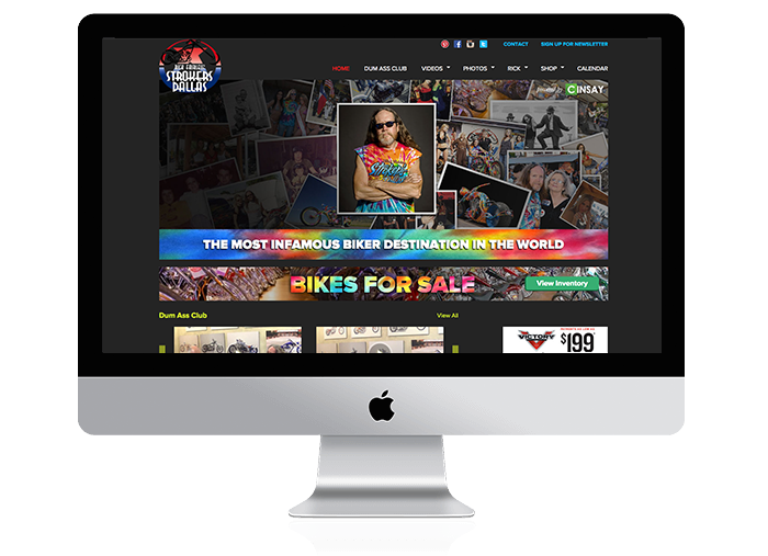
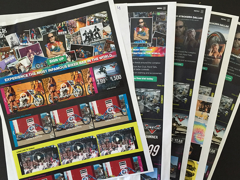
visual design for landing page campaign
Mockups & Prototypes
I created mockups throughout the whole process, refining and tweaking as needed. These mockups helped drive design as I used them in interviews and guerrilla style a/b testing. In the process, I was able to understand what customers thought about the brand, what the purpose of the site was and what to modify. I was able to align the design to what Strokers wanted for the brand while providing the best experience for the user.
SHIP
Site Launch
After launching the site in Jun. 2015, here are some things I learned from user feedback.
Issue: Search
With so much media content, it was imperative to let users be able to search for their favorite content. This feature was brought to our attention through usability testing.
Solution
We added a search feature in both the photo and video sections. The search capabilities included categories and being able to sort by date, comments and ratings.
Issue: Shopping
After launching, the sales increased in merch and people signed up for memberships, but sales of bikes decreased. We needed to put more emphasis back on the thing that started it all - the bikes.
Solution
Bringing the bikes in the forefront of the homepage allowed for people to view the latest bikes. A banner that is clearly prominent that leads to bike inventory helped get those sales numbers up again.
Issue: Loading Time = High Bounce Rate
The site has so much media content that load times were very long and it caused people to bounce.
Solution
This was addressed by the main developer and he figured out how to decrease those load times by optimizing images, minifying javascript and CSS files, avoiding redirects, and optimizing caching.
Project description
The redesign of Rick Fairless' Strokers Dallas website. This project incorporates Rick's unique style, love of all things tie-dye and also aims to connect customers and fans to the empire Rick has created.
The incorporation of Cinsay's video e-commerce technology and live streaming capabilities allow fans and customers to be a part of the Rick Fairless world.