CreditCards.com
Helping users find the right credit cards
Project: Best Cards Page
Roles: UX Design, Research, Interaction Design
Duration: 6 weeks
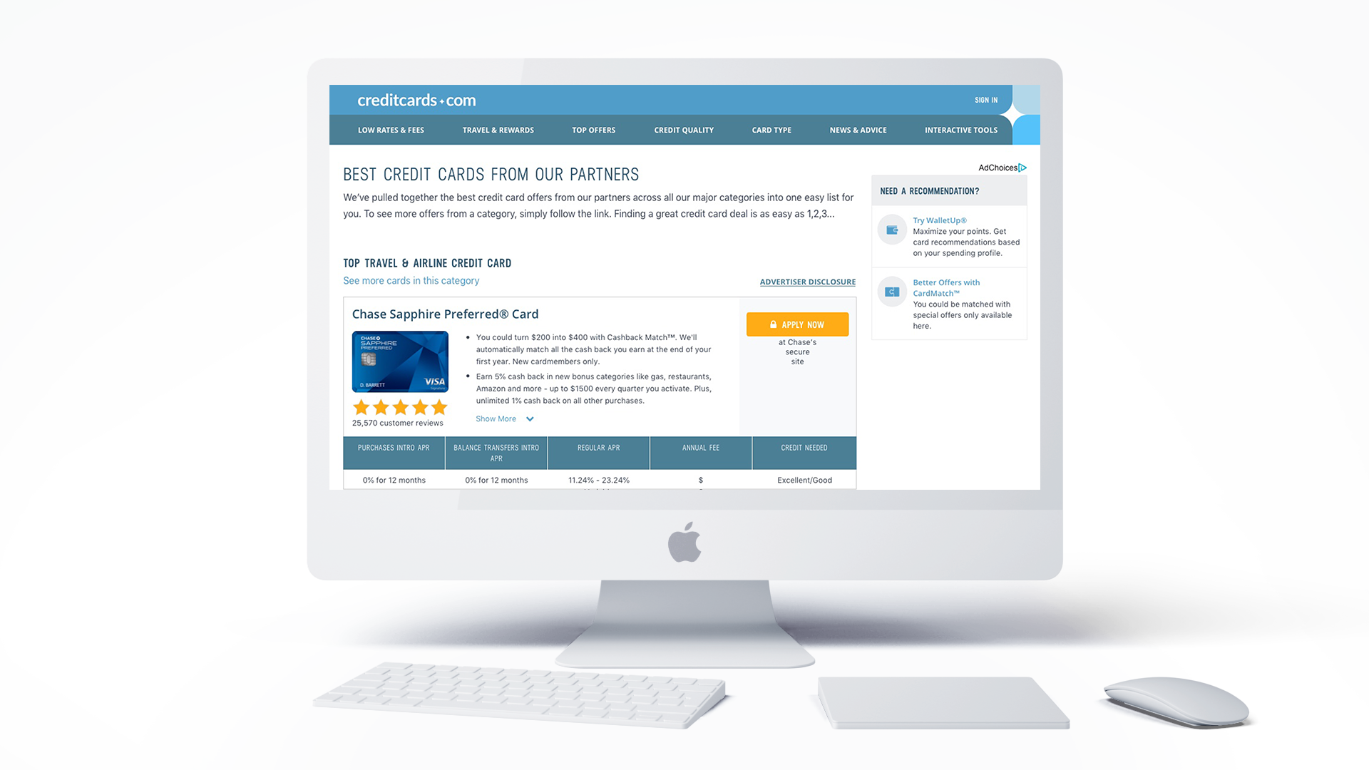
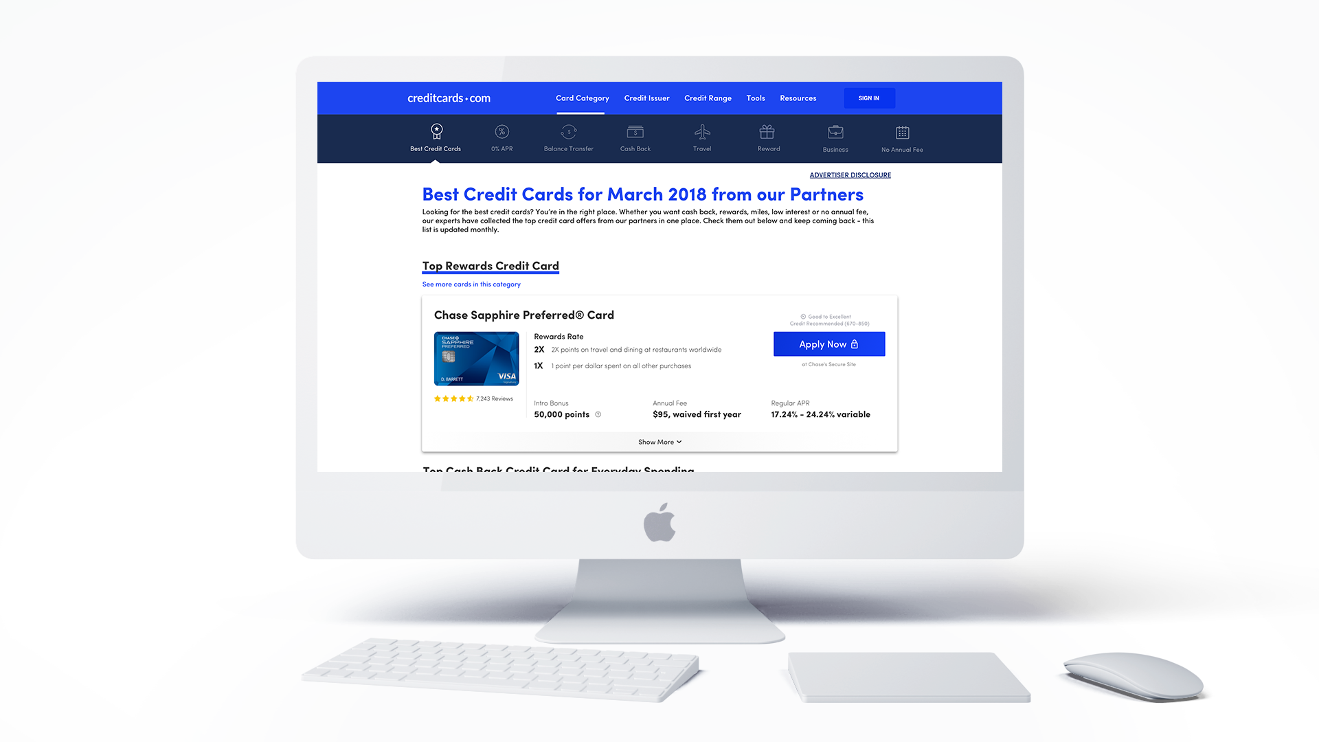
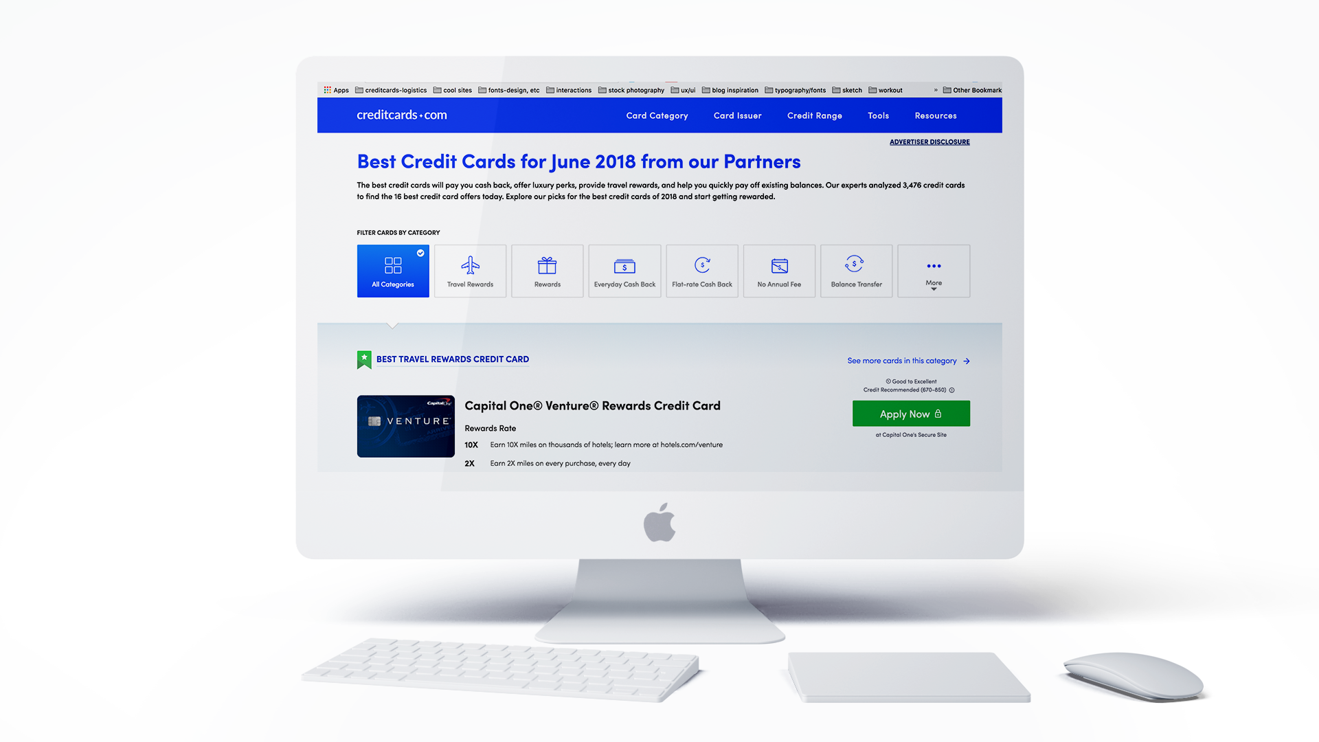
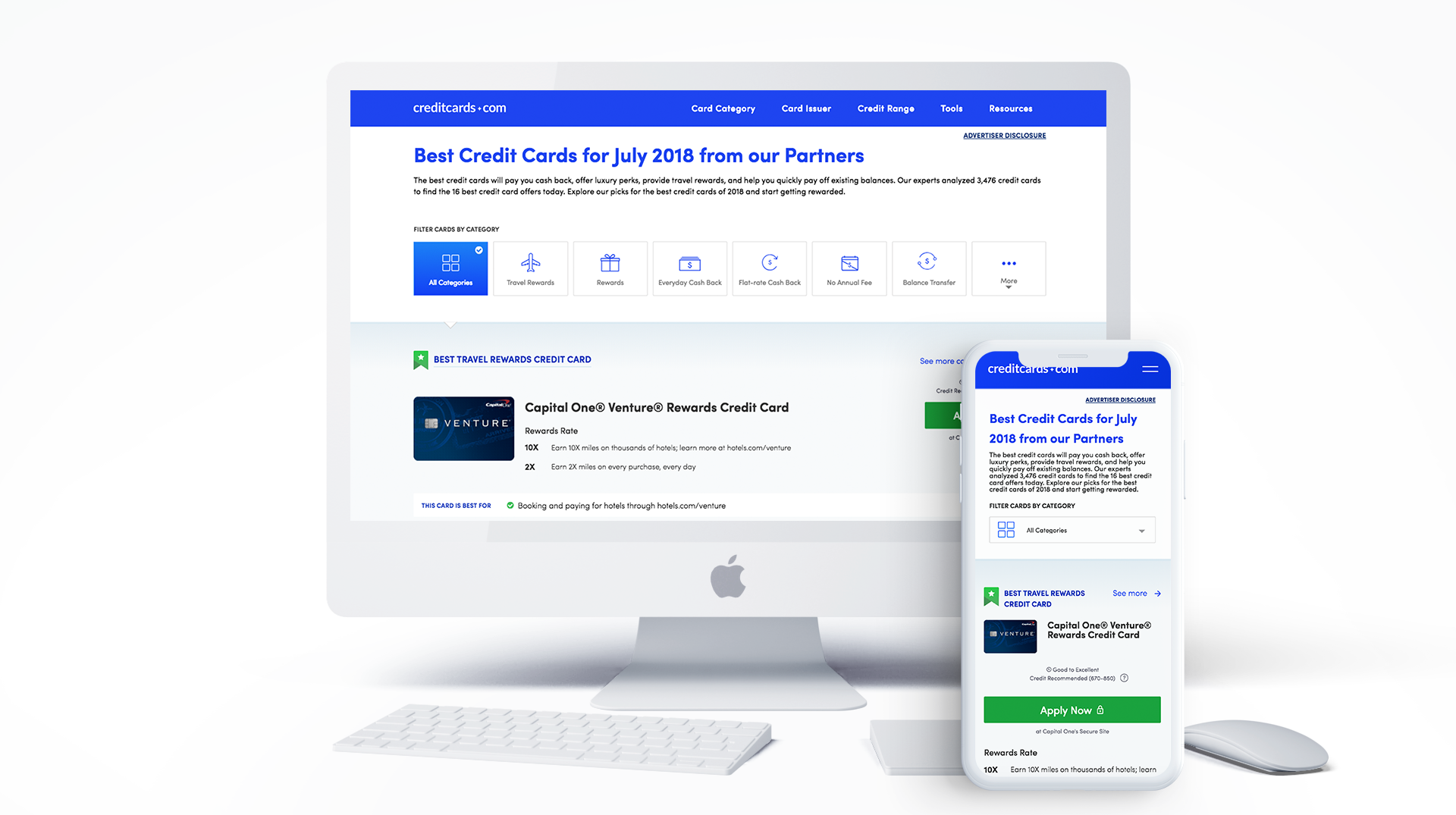
Click through Best Cards page designs old to new
The Problem
Background
The best cards page is the #2 most viewed page on the site second only to the homepage (averaging around 700k page views in 90 days), however the current user experience is lack luster and not reflective of such a highly ranked page. The engagement of the the page in its current state leaves users uninterested and uninformed, usually dropping off at about the third displayed card. After conducting various user tests, studying the landscape of our market and our competitors, we have come to discover :
- Users are unsure of what types of cards (categories) are listed
- Users lose engagement after viewing only 20% of the products on the page
- It is unclear why cards are even listed in the first place. What makes them the “Best”
- Consequently, users are also missing key information to help them make informed decisions about what card to get
The current page lacks necessary context to enable users to make informed decisions about applying for a card. There is insufficient context provided to know what product categories are displayed, why each card is "Best" in its category and why a user should apply.
Process
INFORM/STRATEGIZE
Stakeholder Meetings
With the UX team, I sat down with the product manager to discuss how we could improve the page. We discussed goals, problems and questions (as stated above) about the current design. This meeting also discussed business goals and development limitations. Later stakeholder meetings included members of the Customer Experience team to align and coordinate with business goals.
After running a hot jar test on the Best Cards page, we found that users were only viewing the top third of cards displayed. The majority of users did not scroll down to see other cards. In a business of slotting, it makes it difficult for users to find cards that are best for THEM.Realizing that, we had to think of ways to allow for better engagement with the right cards and clarifying the information about each card.

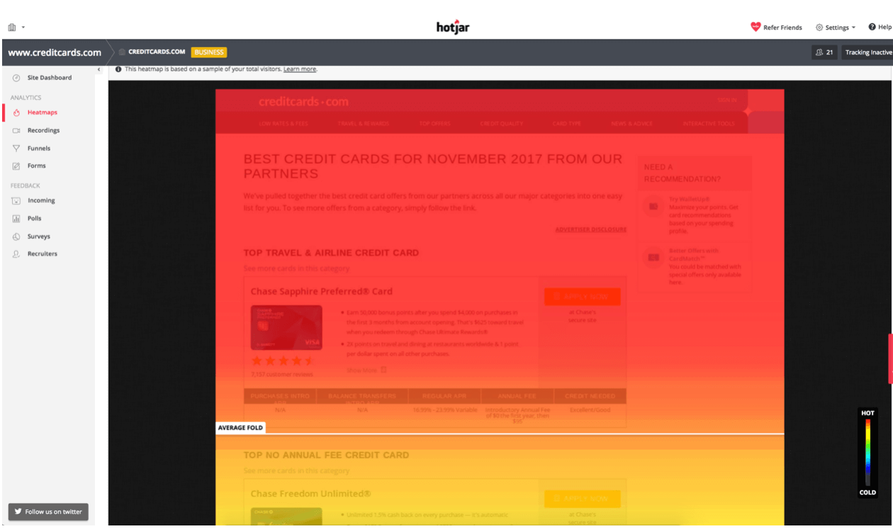
Stakeholder meeting discoveries
Click through for findings
RESEARCH
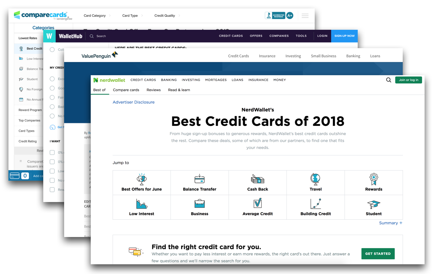
Market Research
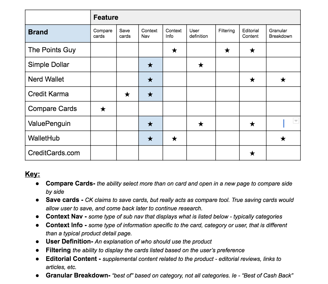
The credit card space has many options. I conducted various studies looking into competitor site features, strengths, weaknesses, color pallettes and more. The high-level result of those findings indicated that CreditCards.com had a lot of catching up to do. Out of the seven main competitors, CreditCards.com ranked lowest in features that customers want.
Below are some of the features that are currently implemented on competitor sites:
- Compare 2 (or more) Cards
- Save card for later
- Contextual Navigation
- Contextual Information
- User Definition
- Filtering
- Editorial Content
- Granularity
DEFINE
Hypothesis Statement
We believe that improving the best cards experience to help users understand which products are available on the page will help them meet their specific purchasing needs and goals. We will know this to be true when we see a 10% increase in offer clicks (response rate).
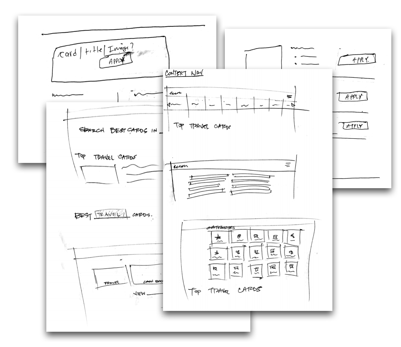
pair design sketches
CREATE
Collaborative/Pair Design Exercise
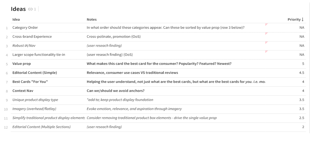
We took the top four ideas generated from the stakeholder meeting and went to the whiteboard and sketch books. Together we time-boxed designs and discussed what features and design elements make sense or would be feasible. Below are the ideas we focused on:
- Value Prop Enhancement
- Editorial Content Relocation
- Contextual Navigation
- "Best Card for YOU" perspective
CREATE
Prototyping
Once we were satisfied with a concept, I put together a mid fidelity prototype to get in the hands of some users. Our goal was to get user feedback to validate or disapprove the design.
The prototype featured a contextual navigation to help the user understand which categories were listed on the page and their associated products and to act as a light filtering.
prototyping video
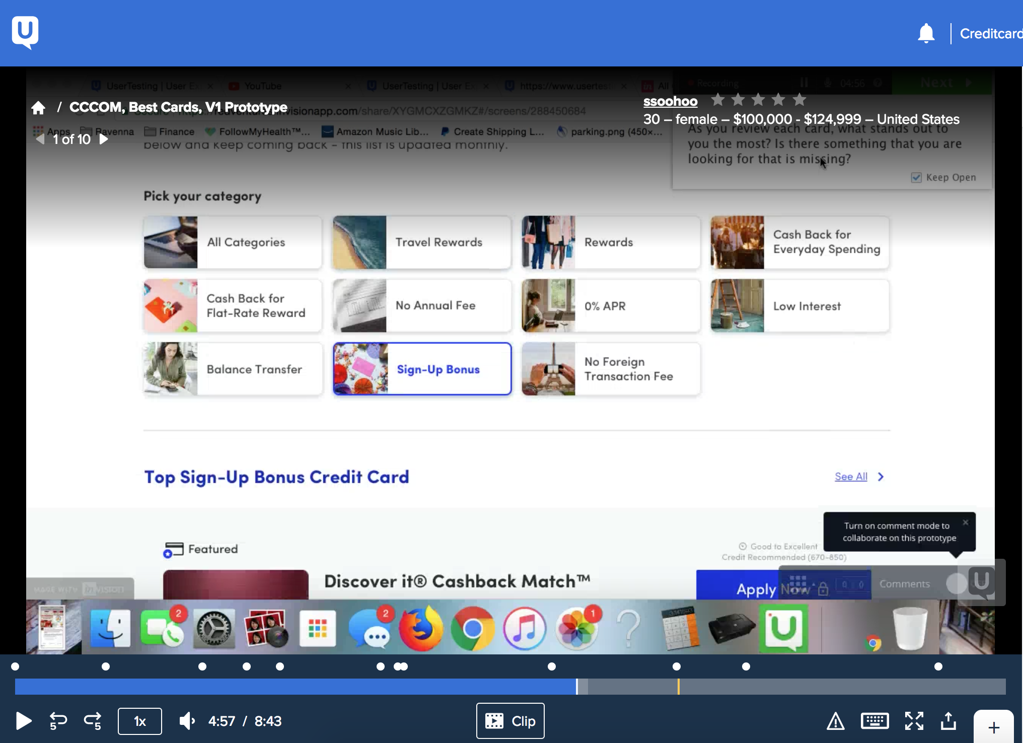
user testing with UserTesting.com
TEST
User Testing
Results - the tests validated our design, allowing users to easily find the cards in the categories they preferred. The categories were "simple to use and helpful."
Additional feedback indicated that users wanted the following:
- Multiple Category View
- Multiple Cards per Category
- Compare Feature
REFINE/CREATE
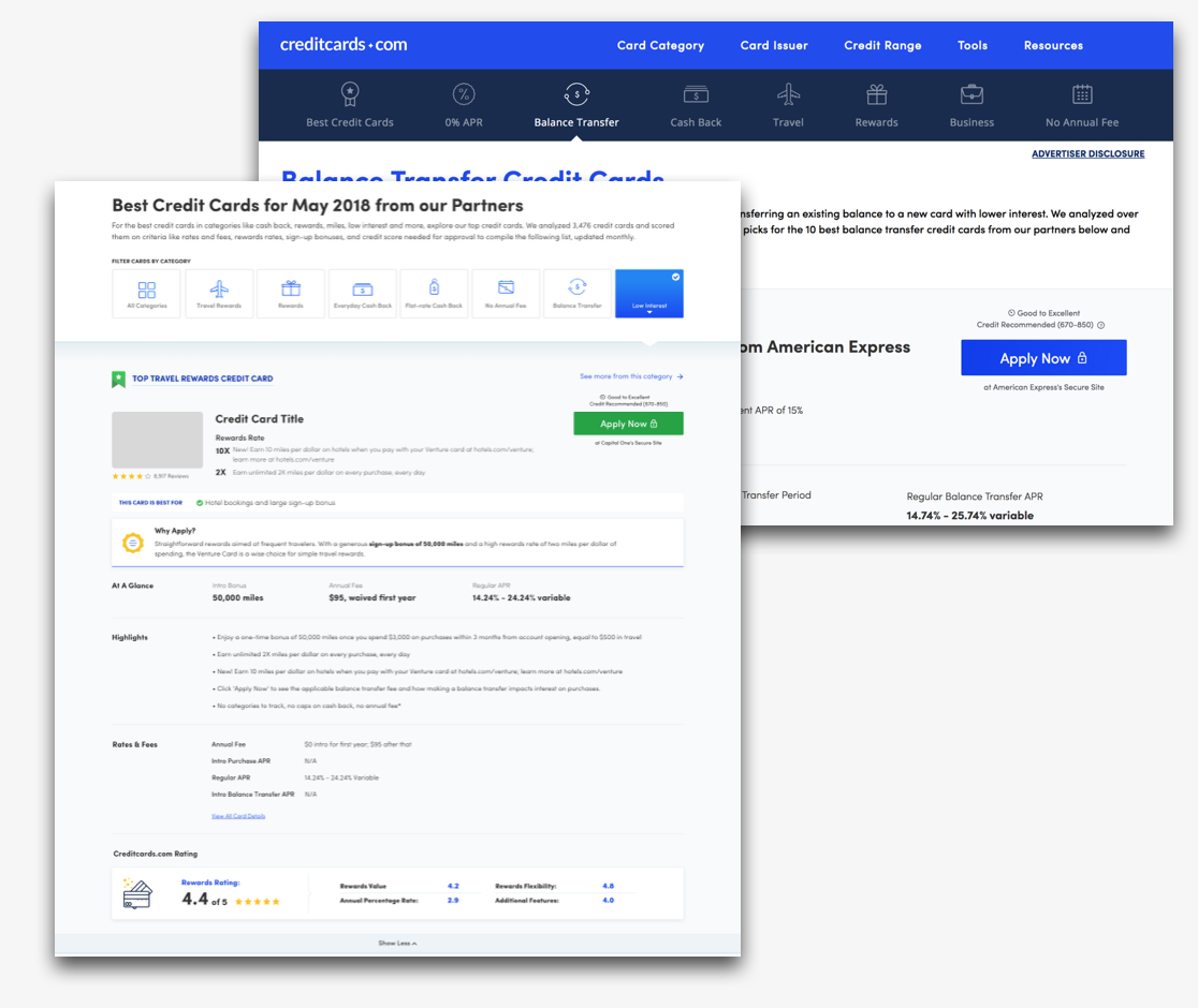
Iteration
Version 1 validated our design, but we decided to iterate to stay consistent with established patterns. The approach we took was to use the iconography used on the category pages instead of the images. This helped maintain a cohesive experience and would maximize efficiency for dev work. The other iteration to the page was to include more editorial content in more visible and logical locations. This content would inform and instruct, providing users with more understanding of why they should apply.
Contributors to the iteration include:
- UX Team
- Visual Design Team
- Content and Copywriters
- Product Manager
updated icons, added editorial value prop
category and accordion animations
REFINE
High Fidelity Design / Animation Design
I spearheaded the UI animation and collaboarated with dev leads to nail down the experience. It was important for us to add engagement and interaction for the users to find the products they desired. The process with the lead dev Rob was awesome. We spent several working sessions refining, brainstorming and collaborating on the interaction.
With my vision and Rob's execution we configured the animation for the following elements:
- Category Selection
- Category Transition
- Accordion expand and collapse
SHIP
Design Handoff
Throughout the process I maintained communication with the developers tasked to build the site. Regular desk checks, QA and approvals by the UX team with the developers made for a smooth transition into shipping. I used Zeplin to coordinate with the dev team and house all assets and screens.
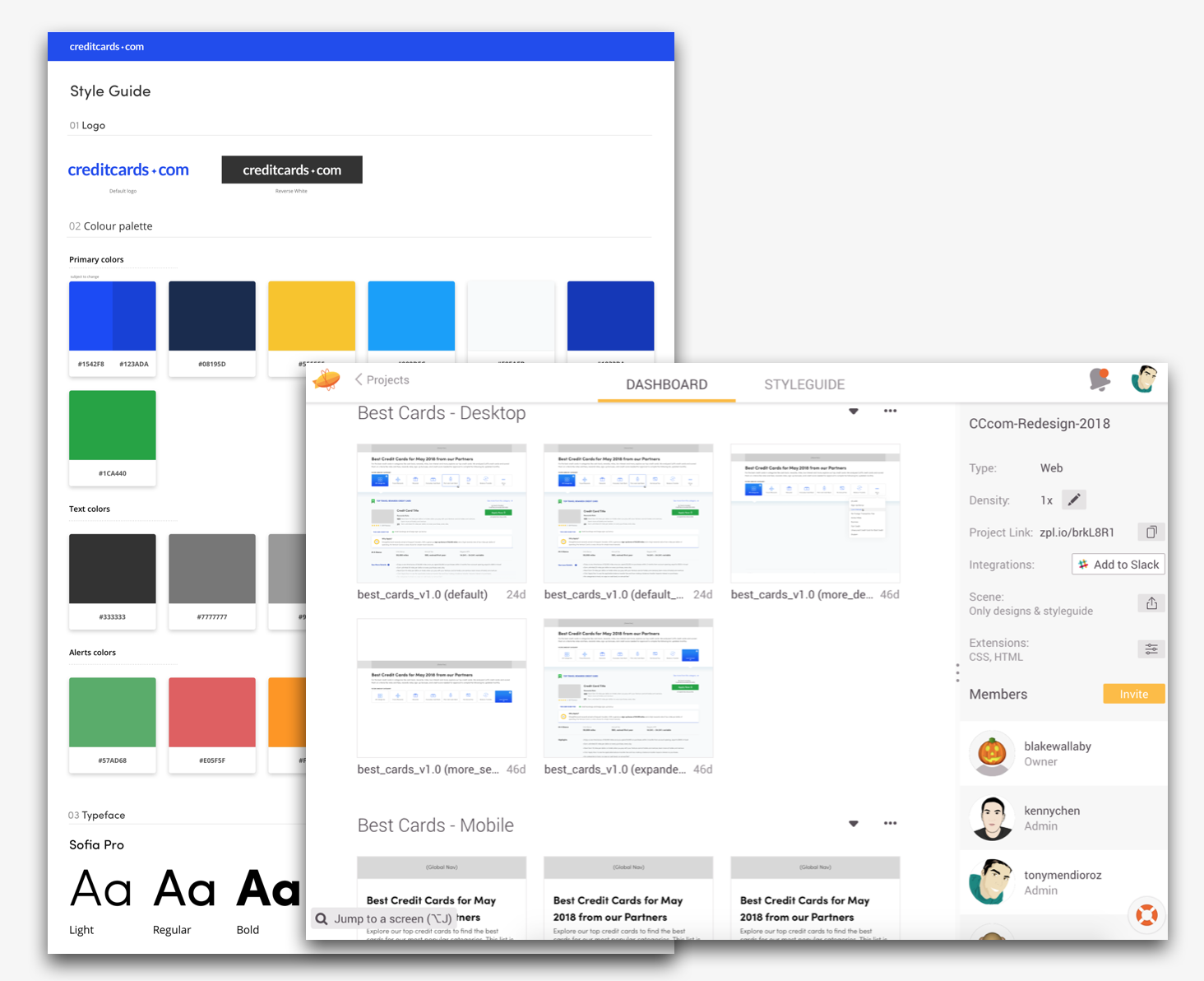
zeplin assets for dev team
" Tony has a keen ability to take design models to technical teams and interpret their needs in a fluid and timesaving manner. It has been the due diligence of Tony's communication and savvy that has saved many hours of development for new initiatives for the Creditcards.com site."
by Jeff Cushler, Director of Engineering, Bankrate Inc,. CreditCards.com Division.
Stats
What is the impact of all of this?
Increased RPA
Since the redesign of best cards page, the Revenue per Approval (RPA) is up 6% - This means that users are clicking on cards that are harder to approve, but yield higher bounties. More informed users are applying to cards previously thought to be out of range.
Increased Rev/PV
Revenue per Page View (Rev/PV) is up 5%. In other words, the amount of money made on average for someone who sees the page. This bottom line metric indicates growth in the right direction for business goals and confirms the projections for Q2.
The Takeway
What does this mean for the user? It means that the design is highlighting more information and providing more context. Thus, they are able to clearly see what the card is good for and who should apply for it. This information is allowing users to make more accurate and informed decisions resulting in better offers.
Challenges & Growth
This project is quite complex, not only when it came to the code base and tech stack, but also coordinating across several teams and various offices country-wide. The various challenges we faced were: Limited developer resources and differences in the “definition of done.”
These challenges allowed us to have open and honest discussions about quality of work and deliverables. I took the opportunity to provide instruction and give tutorials to designers on Sketch and InVision to maintain consistent standards and organized files. While it is still a work in progress, the team grew and has a more cohesive design approach.
Next Steps
We know the work is not done and there is always room for improvement. Due to the limitations and current business goals, there is still much left to do. The next ideas to figure out would be exploring the Compare feature and implementing Multiple Cards displayed per category.
Project description
The CreditCards.com redesign is a complicated, extensive project that spans many teams, offices and technologies. The Best Cards page is just one example to illustrate the process used to achieve success and growth. It is a good representation of hard work, iteration, testing, refining and team work to improve the site and meet goals.