Cinsay
The Transactional Video Player
Project: Cinsay
Roles: UX Design, UI Design, Visual Design
Duration: June 2015
BACKGROUND
The product team asked for my help with the UX of Cinsay's website sign up flow and the backend of the Cinsay Video Player. Together, we collaborated on user flows and interactions on the plans page and within the cms. The things we focused on were:
- Sign Up - the flow that happens during sign up
- Media - adding videos and images in the player backend
- Products - adding products in the player backend
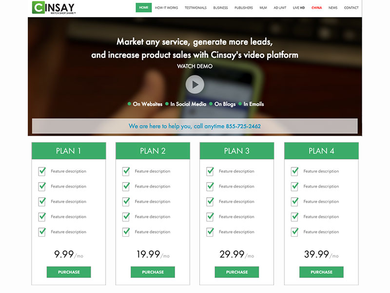
STRATEGIZE/INFORM
Stakeholder Meeting
I sat down with Rob, the Director of Product, and Fino, the Chief Creative Officer, to discuss how to simply organize the sign up flow. The things that we needed to consider were:
- Merchant Account information
- Wait time during activation
- Whats happens once account is activated

brainstorming functions and features
sign up process mocks
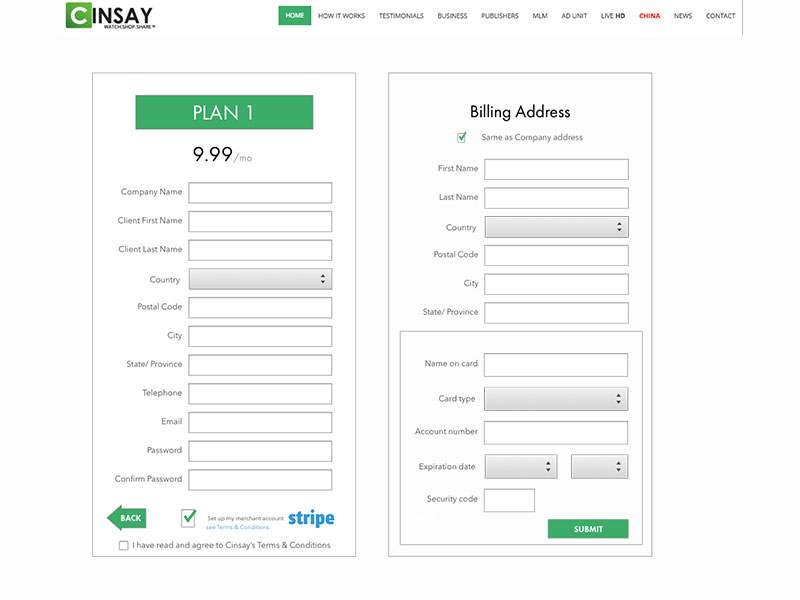
LEARN
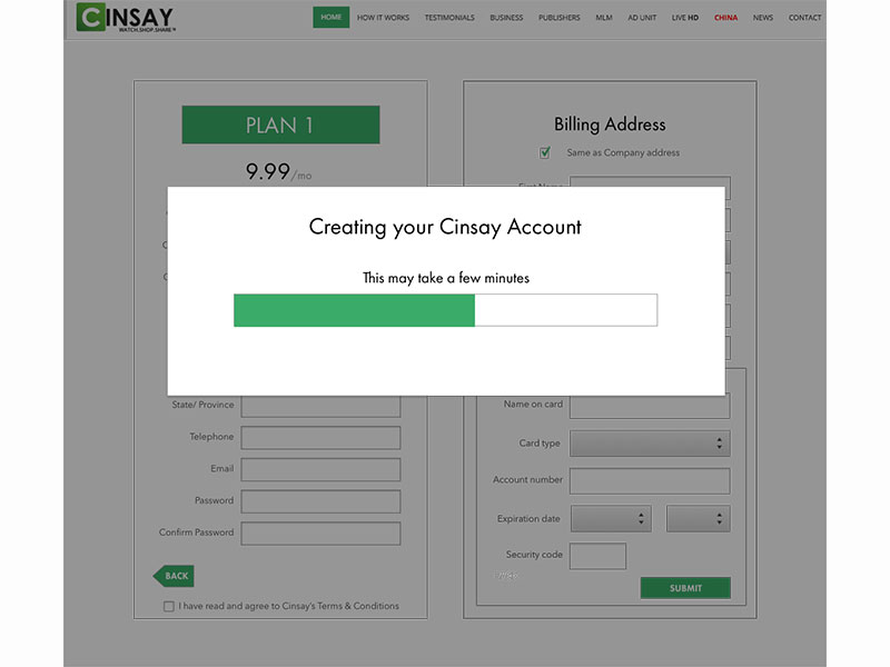
- Eliminate Redundancies- No one likes filling out the same form more than once. Entered information carries over into subsequent forms with check boxes.
- Merchant Account- Using the Stripe merchant account api for the billing information.
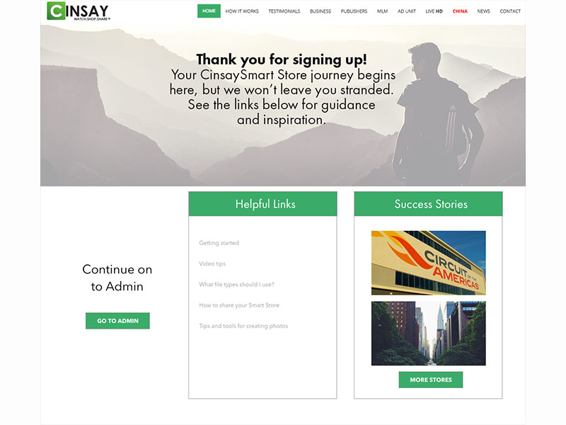
- Visual Cues- a progress bar once you click submit to let the user know that something is happening. A nice thank you message that lets users know once the process is completed.
- Additional Help- helpful links and success stories for users provide answers to FAQs, starting points and examples to look to.
BACKGROUND
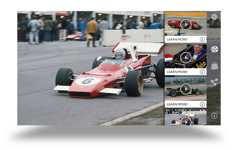
The Backend CMS
The backend content management system is complex and a lot of users have trouble with creating and getting their players out there. Again, with the director product we aimed to find the problems that so many people had. We decided to take a couple of approaches:
- The Heuristic Approach - evaluate the original layouts for usability issues.
- Metrics Evaluation - use data to see where users drop off in the process of building their store.
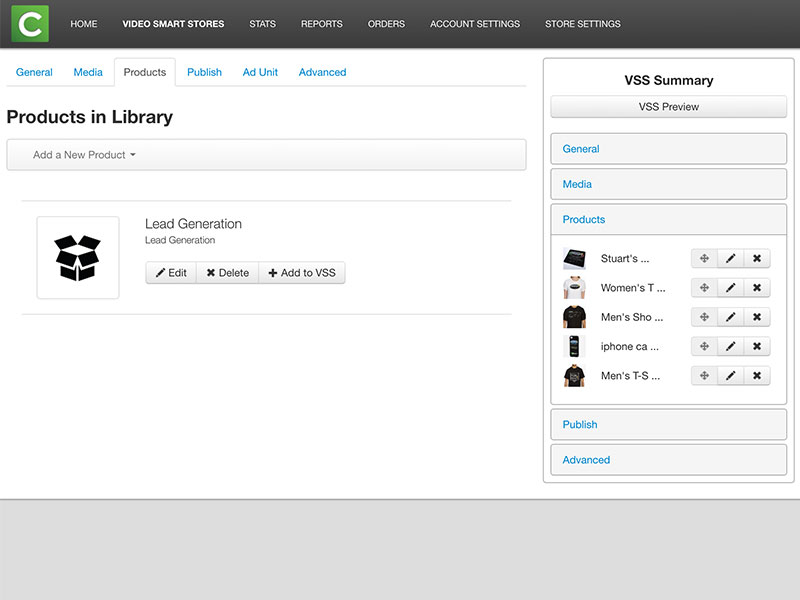
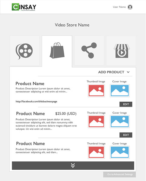
Original "Add Products" page Analysis
Based on data from customer support, users dropped off when trying to add products. Support specialists spent a lot of time dealing with users who were having trouble knowing what product type to choose, what the image was for and the file type to use. Here are some observations we came up with.
- Hints without Answers -Some fields have asterisks but no explanation of what is needed. Lacks clarity in image purpose.
- No Visual Hierarchy -It is organized, but items are not aligned and spacing is awkward.
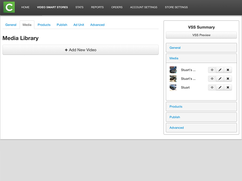
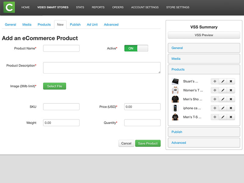
Original "Add Media" page Analysis
The other drop off point was adding videos. The same issues applied here as in the product section.
- Ambiguous Titles -"Media" is vague and can mean a lot of things- video, images, audio, etc.
- Confusing Actions -"create video" button is misleading.
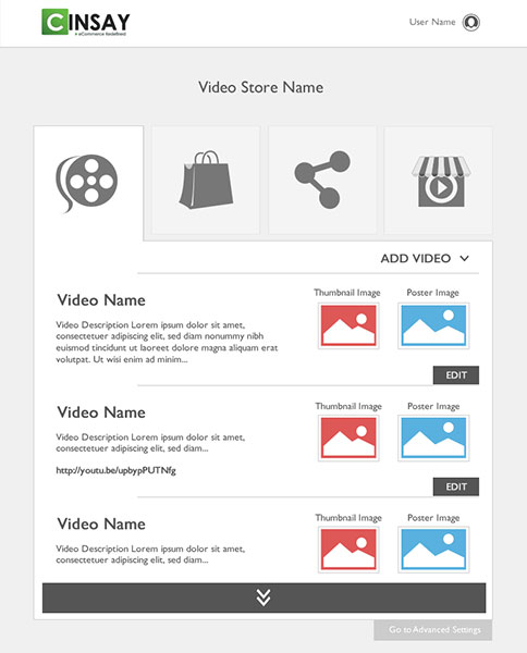
The Solution
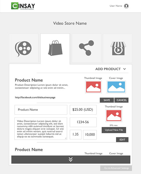
New "Add Products" page
- Increased Scannability -the organization and layout is structured providing visual cues like differentiating image types with size and color.
- Progressive in-line interactions -icons and tabs provide a quick way to edit items without dialogs or pop ups.
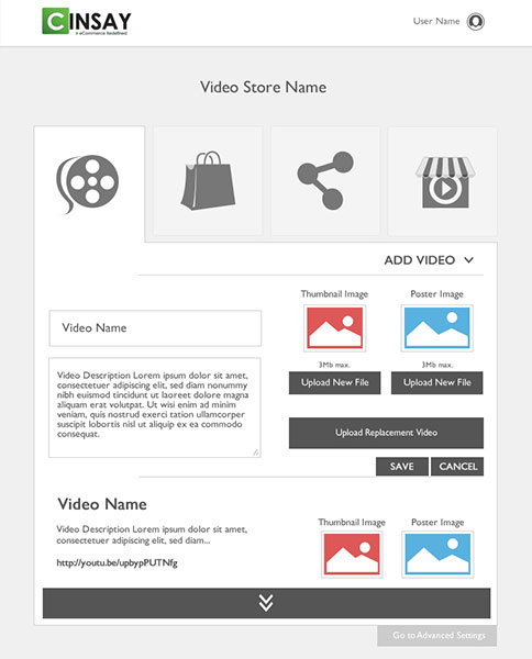
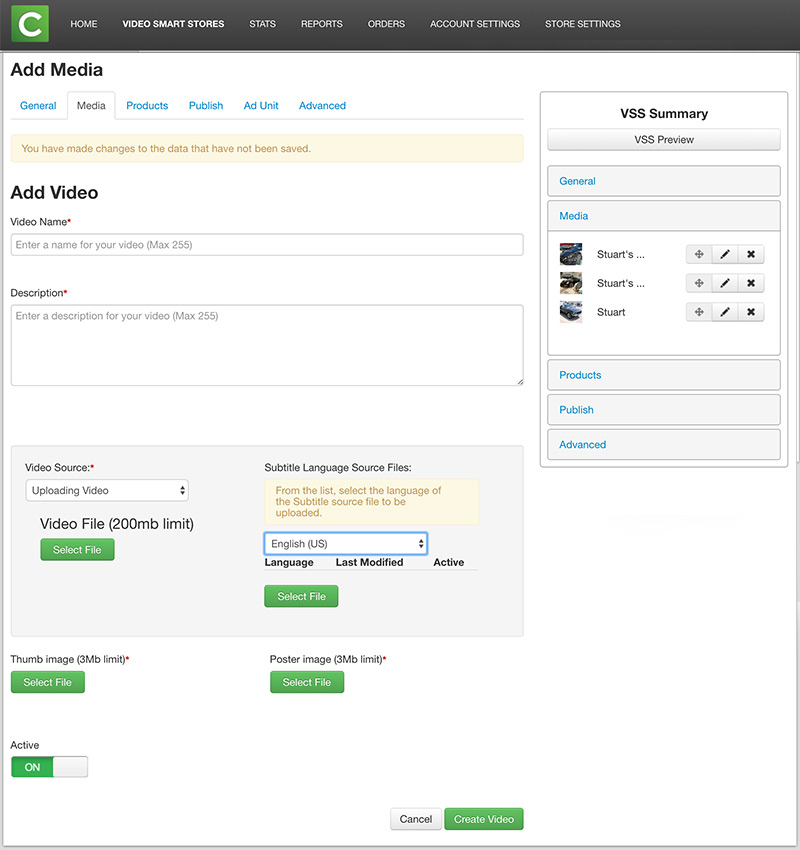
add video process

add video process
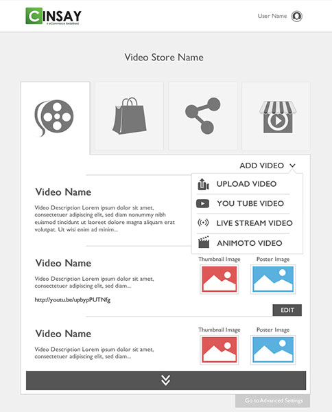
New "Add Video" page
We used the same techniques as the product page that are mentioned above; we also incorporated a few more:
- Icons & Logos - the use of imagery to quickly identify video source and file types to help identify what you are creating.
- Clear Verbiage - the "save video" button clarifies the end of a process, or at least a step in the process.